Procreate vs. Adobe Fresco (A Review)
As a professional lettering artist and designer, I’ve been using Procreate for over 3 years now on my iPad Pro. For this reason, I’ll admit that I was slow to adopt Adobe Fresco. I figured that Procreate was the best digital drawing app out there, and since I found myself comfortable with my workflow, there was no sense in changing.
It wasn’t until I started watching other lettering artists and illustrators on Adobe Live that I had the idea of using Adobe Fresco. Then I decided to hold an (unofficial but still insightful) survey in my Instagram stories that revealed that out of around 100 people, 70% had never even tried Adobe Fresco. 96% said they used Procreate as their preferred digital drawing app, and 75% have Adobe Creative Cloud subscriptions.
After about 1 month of creating exclusively in Adobe Fresco, I’m happy to share with you my thoughts on how it compares to the beloved Procreate. I hope that after this review, you are more familiar with the Adobe Fresco app and why it might be a useful addition or alternative to your current creative workflow. Below is my opinion based on my own personal experiences. This review is not sponsored.
1. Interface
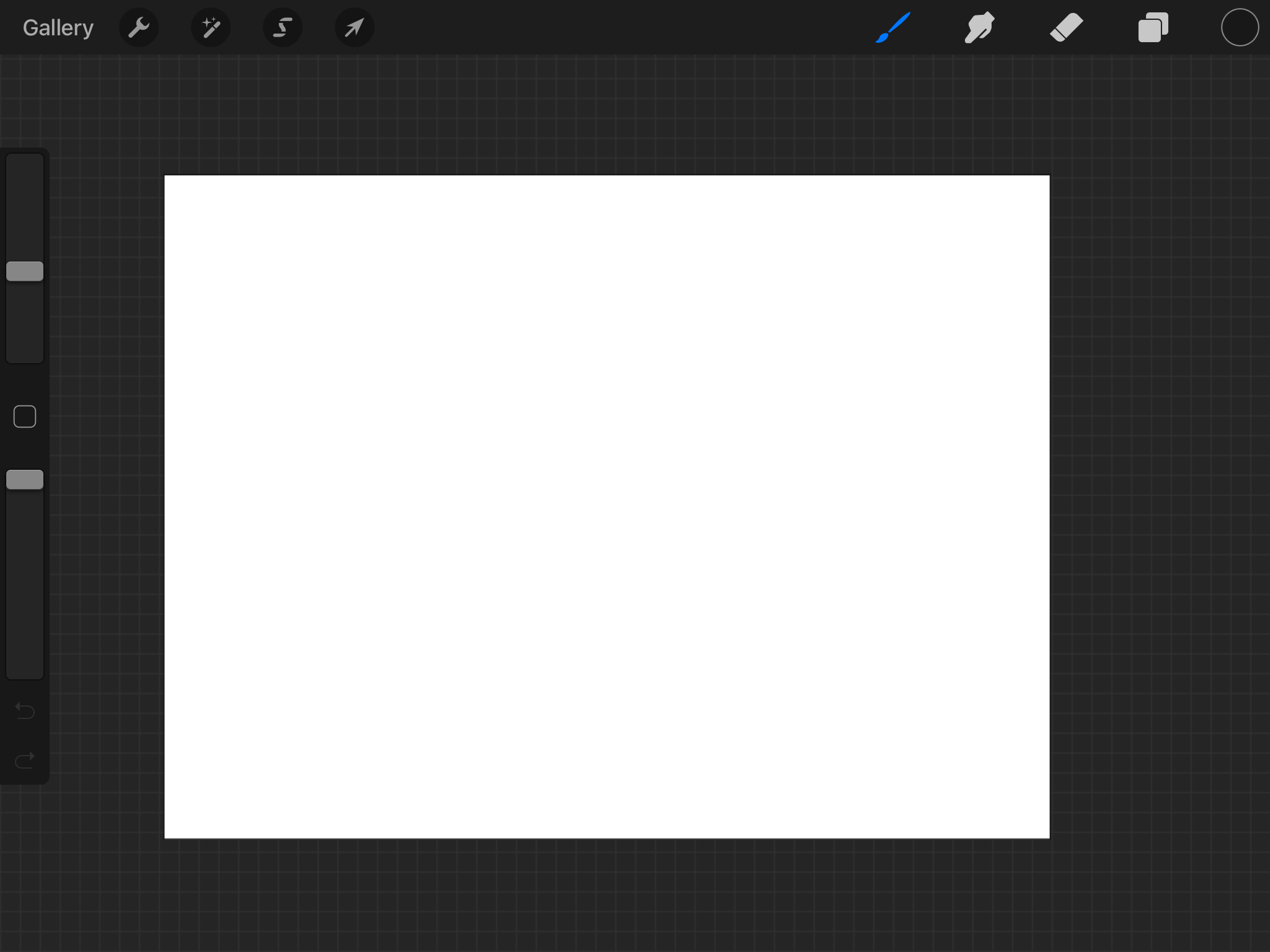
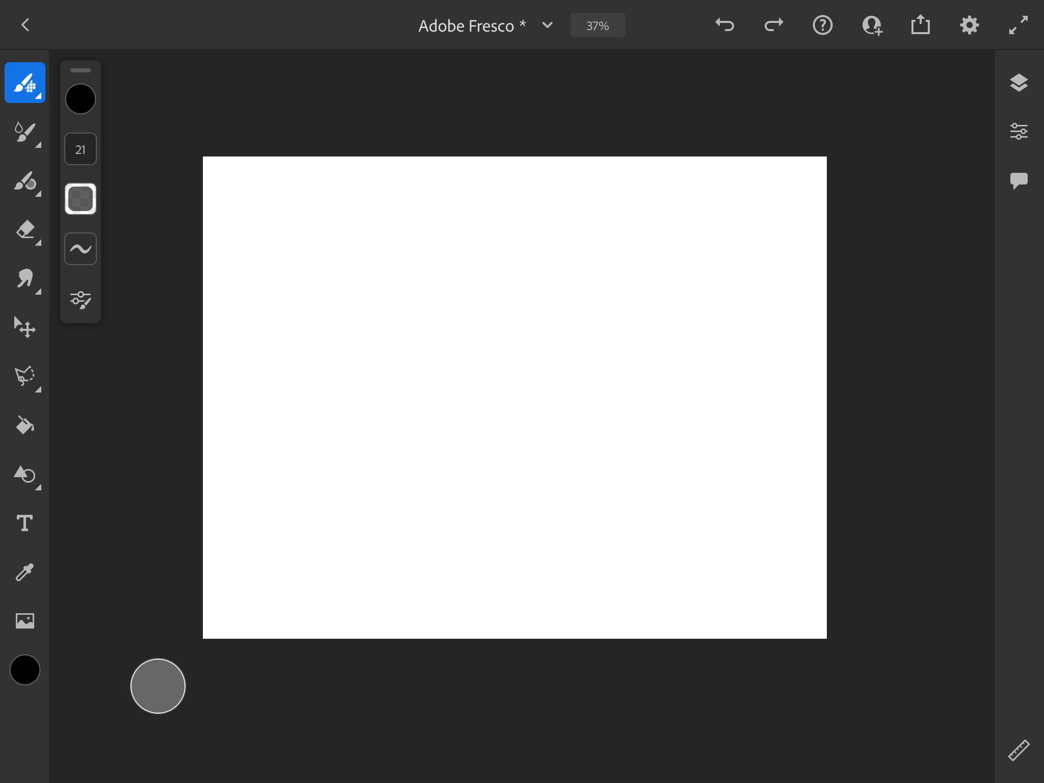
At first glance, the interfaces for Procreate and Adobe Fresco look very similar. Adobe has always been good at making all of their products look and feel consistent. For example, if you’ve already tried Adobe Illustrator or Photoshop, not much about Adobe Fresco may even feel very unfamiliar to you. One part of the Fresco interface I enjoy is that basically everything happens on one screen. In Procreate, edits to brushes open in a separate screen interface. In Adobe Fresco, you have pop-up windows that can be moved around freely so you're always on the same screen as your work. The experience feels more customizable, and as an Adobe Creative Cloud user, the rhythm of working with Adobe Fresco felt very natural.
However, there are a few things that I would love to see in future versions of the app that I felt were lacking. There are no guidelines or grid snapping which made it hard for me to establish if my work was level and centered to the artboard. For now, Adobe Fresco has a ruler tool to help you draw lines on your artboard at any angle, that also snaps at 90º and 180º. Call me a bit lazy, or paranoid, but I like the grid view in Procreate and I hope it’s an option in Fresco soon.
2. Gestures & Features
Procreate has several gestures and shortcuts that have become almost second nature to a lot of creatives (double-tapping your sketchbook to undo anyone?) Thankfully, you’ll find a lot of similar features present in Adobe Fresco. Two-finger double-tap to undo, two-finger pinching to zoom-in & out, two-finger canvas rotation, and dragging & holding to get a straight line, just to name a few.
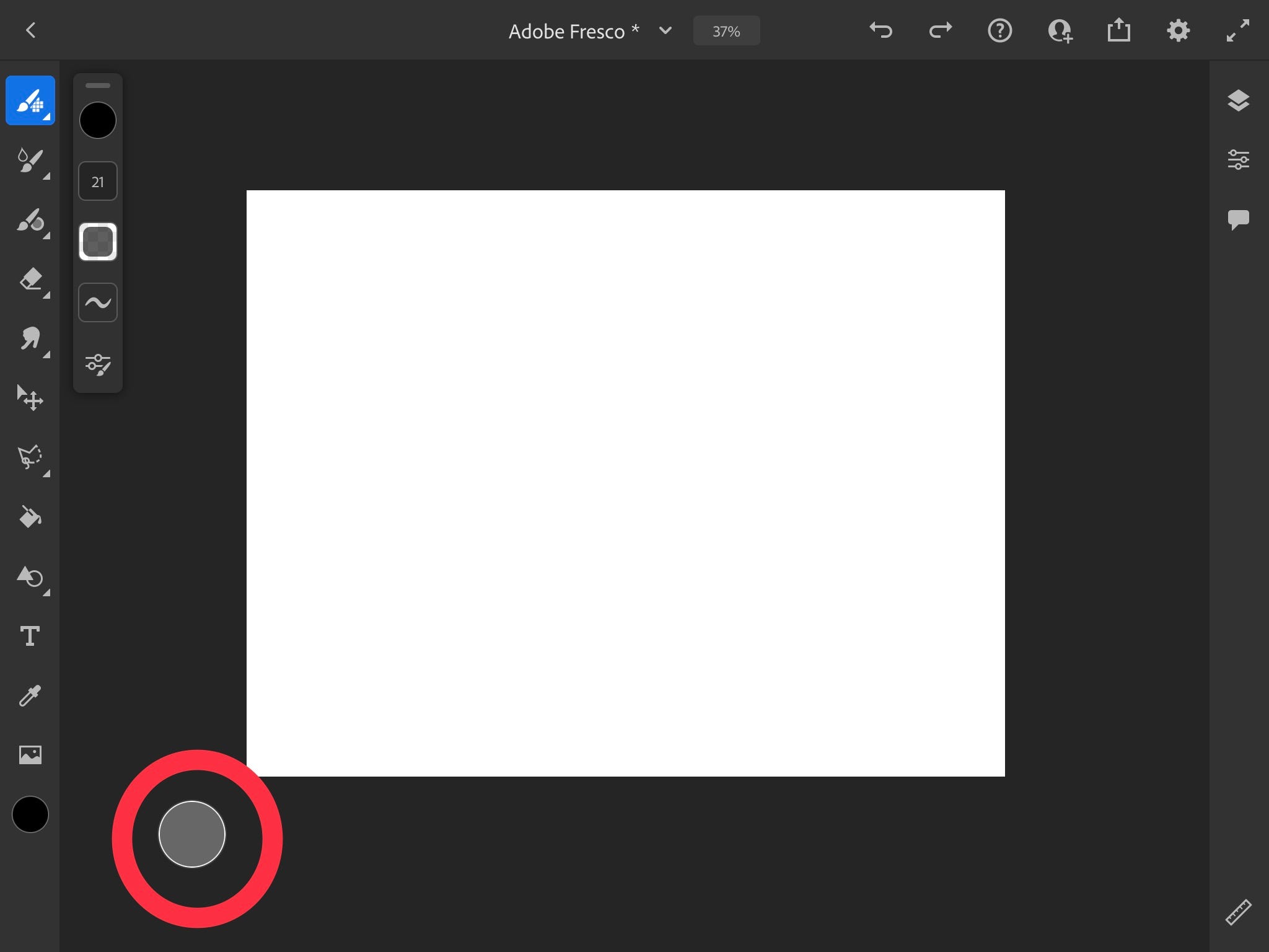
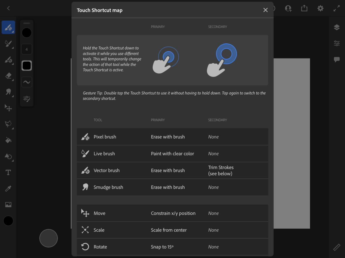
A separate feature you may find interesting in Adobe Fresco is their touch shortcut. Holding it down allows you to do more with certain tools. For example, if you press it and hold it while you have a pixel or vector brush selected, it will turn that brush into an eraser. Kind of cool right?
It also activates special blend states for the live brushes that mimic traditional painting materials. The capabilities of this small button are so robust that they provide you with a “touch shortcut map” to help users navigate the feature.
3. How Adobe Fresco stands out
Brush Categories: Pixel brushes, Live Brushes, and Vector brushes.
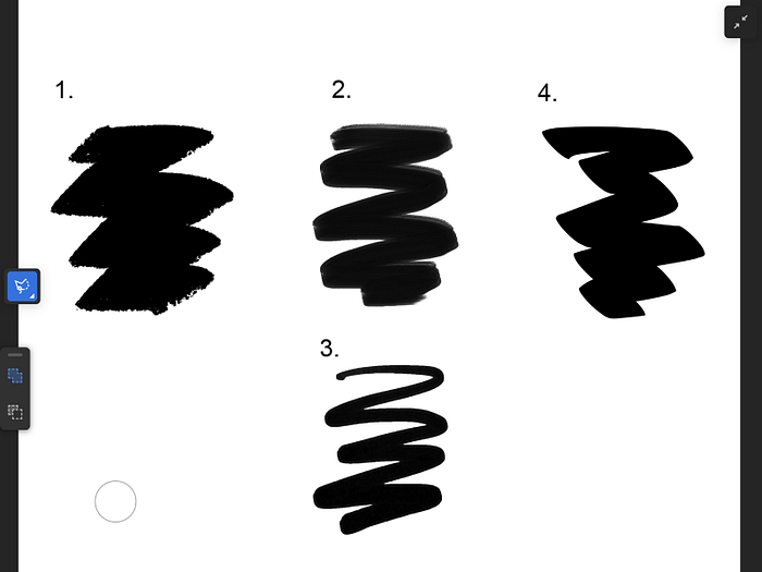
- Pixel brushes produce your artwork using small dots. All Procreate brushes are pixel or raster brushes.
- Live brushes come in “watercolor” & “oil” and allow you to produce very realistic results (without the mess!)
- Vector brushes are a game-changer because you can draw on your tablet and produce a lossless quality drawing.
Each of these 3 broad categories features a number of subcategories of brushes (there’s even a “lettering” category.) But seeing the vector brush category made my jaw drop. Vector = infinitely scalable, high-quality graphics. If for some reason you don’t have the time to vector your work in Adobe Illustrator, this could be a great last minute option.
Adobe CC Integration
You can take your piece from Adobe Fresco and with the click of a button, send it to Illustrator (which will automatically open on your desktop because magic is real). You can also save your work as a Photoshop file and open it there. Photoshop brushes can also be imported into Adobe Fresco so if you’re someone who enjoys using Photoshop for your work, Adobe Fresco might make a helpful addition to your workflow.
There are no layer limits
I know. Sit back for a moment and reflect on that. None. You can have as many as you’d like. I’ve personally struggled with this in Procreate especially as I work in higher resolutions. A major win for creatives who can’t quite commit so the answer is always a new layer (aka this is me please let me know if it’s you too.)
It’s available for free
A subscription to Adobe Creative Cloud is not needed to use the Adobe Fresco app. While I’ve never used the free version of Adobe Fresco, it’s important to know that there will be limitations to the app’s capabilities. If you want to upgrade to a premium experience, Adobe Fresco is available for just $9.99 per year after a free trial.
It’s available for iOS & Windows
Depending on the version of your device, Adobe Fresco is Windows compatible, unlike the iOS-exclusive Procreate.
4. Popularity Contest
I decided to test each app’s discoverability by keyword searching “drawing apps” in the App Store for iPad. Procreate was among the first few listed. Adobe Fresco wasn’t discoverable at all on that page. It wasn’t until I searched “Adobe” that Fresco was listed…at the bottom.
That being said, Procreate has been on the market since 2011 while Adobe Fresco has only been out since late 2019. It makes a difference when it comes to positioning yourself in the market and taking years worth of feedback from users to make the best product possible.
Conclusion
Though I’m technically done with this “experiment,” I’ll keep using Adobe Fresco for personal work that I feature on my Instagram. I think there’s power in creative dexterity and I’m glad I chose to broaden my horizons.
What do you think? Has anything from this review made you curious enough to try Adobe Fresco? Found this interesting and insightful? Share it with a friend (or two!) What other creative tools or softwares should I review? Let me know in a comment below.
Check out my Domestika Adobe Fresco lettering course
Try Adobe Fresco for free today
Get Procreate
Alanna Flowers is a freelance lettering artist & illustrator based in New York where she runs AGF Design Studio. Feel free to connect via Instagram, Twitter, YouTube, or her newsletter to keep up with AGF Design Studio, and to help grow our creative community.
Some links my include affiliates that help support my business at no extra cost to you. Thank you for your support!
